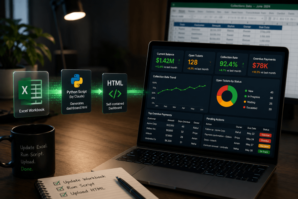
Last week I argued that most AI dashboards fail because they’re designed as demonstrations instead of operational tools. The biggest culprits were what I called the Access Gap and the Format Drift. One disconnects the dashboard from the data. The other breaks it every time the underlying files change.
This week I want to show you the approach I used to avoid both.
Most people assume building an operational dashboard requires Power BI, Tableau or a developer. However, if your operational data already lives in Excel, you’re much closer than you think.
You don’t need to learn Python or become a software engineer.
What you need is a well-structured Excel workbook, Claude, a one-time five-minute Python installation and a free GitHub account.
The workflow is surprisingly simple.
Excel Workbook
↓
Python Script (written by Claude)
↓
Self-contained HTML Dashboard
↓
GitHub Pages
↓
Live Dashboard
Claude writes the script once. That script reads your Excel workbook and generates a completely self-contained HTML dashboard.
Every time your data changes, you simply rerun the script and replace a single HTML file. The dashboard stays the same. Only the numbers change.
That’s what I mean by plug-and-play. Not one-click AI magic that we see in the demo videos, but a system that works with the files you already have instead of waiting for APIs, connectors or system integrations. Point it at your Excel workbook and it does the rest.
Start with the data, not the dashboard
The dashboard is only as good as the file behind it so before you open Claude, spend thirty minutes reviewing your Excel workbook. Ask yourself three simple questions.
- Is all the operational data in one workbook, or scattered across multiple files?
- Does every worksheet follow the same column structure every month?
- Are dates and amounts stored as actual values instead of formatted text?
If next week’s workbook introduces new columns or changes the structure, your script will have to change as well. Consistency matters far more than complexity. A dashboard is only as reliable as the data feeding it.
You also don’t need to model every operational process on day one.
One lesson I learnt while building mine is that a dashboard with four accurate sections is far more valuable than one with eight broken ones. Start small. Once the foundation is solid, expanding it becomes surprisingly easy.
Design around questions, not metrics
This is the step almost everyone skips.
Most people start by thinking about charts, tables and KPIs. They open Excel, look at the data and imagine what the dashboard should look like.
I think that’s backwards.
Every operational dashboard exists to answer a handful of recurring questions. Start there instead.
Questions like:
- What’s our current balance?
- How many tickets are still open?
- What’s our collection rate this month?
- Which payments are overdue?
- Who owns each pending action?
Those questions naturally become sections of your dashboard.
For each one, identify which worksheet contains the data, which columns are required and whether the answer is a sum, count, filter or calculation.
Define your colour logic at this stage too. Don’t just say “highlight problems” — set thresholds. For example: green if collection rate is above 90%, amber between 75–90%, red below 75% or if an action item is overdue. Colour is what makes a dashboard scannable in ten seconds, and Claude can only encode thresholds you’ve actually decided.
This document becomes your design specification, and you’ll hand it directly to Claude.
Notice what happened there.
At no point have we talked about Python, HTML or CSS.
We’ve spent all our time defining the business problem till now.
That’s exactly how good software projects begin. Design first, tools later.
Having said that before generating the dashboard you’ll need Python installed along with the openpyxl library which Claude can guide you how to install.
Treat Claude like your developer
Most people prompt AI like this:
“Build me a dashboard.”
That’s too vague.
Instead, brief Claude the same way you would brief a developer joining your project.
Your brief needs five things:
- What the output is (a single self-contained HTML file)
- Where your data lives (the file path, and which sheet holds what)
- What each section shows (one at a time — data, calculation, what to highlight)
- Your colour logic (what counts as green, amber, red for each metric)
- How to handle any photos (embedded as base64, so the file works the same everywhere)
Here is a rough version of what I used:
I want to build an internal ops dashboard as a single HTML file.
It should open in any browser with no login required.DATA SOURCE:
Excel file at: [full file path]SECTIONS:
[Section name]: Data from sheet “[Sheet name]”, columns [list them].
Show [metric]. Highlight red if [condition], amber if [condition], green if [condition].
[Repeat for each section]DESIGN:
– Clean white background, dark header bar with title and date generated
– Stat cards at the top for the most important numbers
– Tables for multi-row data
– No charts, numbers and status colours only
– Mobile-friendly layoutOUTPUT:
Write a Python script called generate_dashboard.py.
Running it with no arguments produces dashboard.html.
Just couple of years ago, having an idea for an internal dashboard wasn’t enough. You still needed someone who could translate that idea into code. AI has dramatically compressed the distance between those two steps.
The bottleneck is no longer implementation. It’s clarity.
That’s why I think one of the most valuable skills in the AI era isn’t programming.
It’s learning how to define problems so clearly that another intelligence, whether human or artificial, can build the right solution.
Expect iteration, not perfection
The first version Claude generates will almost certainly be wrong.
Mine was.
The layout looked exactly the way I wanted, but some calculations didn’t. A few columns were mapped incorrectly, one section was showing all-time totals instead of just the current month, and another wasn’t filtering closed tickets properly.
None of that worried me.
I wasn’t expecting Claude to build the finished dashboard in one attempt. I was expecting it to give me a solid first draft.
That’s an important mindset shift.
Don’t start rewriting your entire prompt because the first version isn’t perfect. Treat Claude the same way you would treat a developer on your team. If something is wrong, explain exactly what’s wrong.
“The total should only include this month.”
“The amount is in column F, not column G.”
“This table should exclude closed tickets.”
Each iteration makes the dashboard a little more accurate.
In my experience, two or three rounds are usually enough to get very close to the final version.
The first version isn’t the end. It’s the beginning of a conversation.
If you’re using Claude Desktop with Cowork mode, the process becomes even smoother because Claude can inspect the workbook, generate the script, review the output and refine it within the same conversation. Instead of jumping between applications, you stay focused on improving the dashboard itself.
Build once. Refresh forever.
Once the dashboard is working, something interesting happens.
You stop thinking about building it. Instead, you start thinking about using it.
I host mine on GitHub Pages because it’s free, takes only a few minutes to set up and gives me a permanent URL that opens in any browser. Every week I update the Excel workbook, regenerate the HTML file and upload the latest version. The URL never changes. Only the data does.
That completely changes the relationship with the dashboard.
It stops feeling like another project that constantly needs maintenance and starts behaving like any other operational tool. Updating it becomes part of the reporting routine rather than a task you have to plan for.
The workflow eventually becomes remarkably simple.
Update the Excel workbook. Run the script. Upload the new HTML file. Done.
One caveat before you upload anything: GitHub Pages serves your page publicly even if the repository itself is private. Anyone with the exact link can view it. Decide based on how sensitive your data is — for anything genuinely confidential, keep the HTML file local and share it directly. It needs no server to open.
Once everything is working, you can even ask Claude to create a simple double-click launcher so you don’t need to open Terminal again. At that point the entire refresh process becomes:
Update Excel → Double-click → Upload.
The whole thing takes less than five minutes.
Once you’ve invested the effort upfront, using it becomes almost effortless.
Intent > Syntax
Looking back, the interesting part wasn’t that I built a dashboard without writing code.
It was that I stopped thinking like someone waiting for a developer.
For years, if I wanted a dashboard like this, my instinct would have been to write a requirements document, hand it to an engineering team and wait for it to be prioritised. That’s how most of us in operations have been conditioned to work.
AI changes that relationship – Claude wrote every line of the script. I architected it.
That’s the whole idea behind Intent > Syntax: the value isn’t in who typed the code, it’s in whether the person specifying it actually understood the problem.
That’s why I don’t think the biggest opportunity in AI belongs only to developers.
It belongs to people who deeply understand how work gets done.
People like Operations leaders, Program managers, Finance teams, Support organisations.
People who know the questions that matter.
Last week I argued that most AI dashboards fail because they’re built as demonstrations instead of operational systems.
This week wasn’t really about building a dashboard.
It was about building one that you’ll still be using six months from now.
I think that’s the difference between an AI demo and an AI solution.
One impresses people for five minutes.
The other quietly becomes part of how work gets done.
P.S. I also created a detailed companion guide that walks through the entire setup, including prompt templates, GitHub Pages configuration and common troubleshooting scenarios. If you’d like to build something similar, that guide will get you there much faster than trying to piece everything together from screenshots and YouTube videos. To get the guide just DM me or Comment “Guide” & I will send it across.
And if you’d rather have this built for you than build it yourself — for your team, your society, your operation — that’s a conversation I’m happy to have: Work With Me.
Found this useful? I will continue sharing practical strategies for operationalising AI in future editions of The Abhay Perspective. Subscribe below and to my LinkedIn newsletter for future updates.


 The Abhay Perspective
Leave a comment