 Abhay Kapoor

If you follow AI capabilities through YouTube, blogs, or LinkedIn, you’ve almost certainly seen the claim: build a fully working dashboard with Claude or ChatGPT in ten minutes flat.
The premise is always the same: connect this app, authorize that integration, watch the numbers populate live.
But let’s be honest about what most of these actually are: a one-off demos.
The moment you try building one yourself, and your data isn’t neatly contained in a single Google account (mail, calendar, and little else), you hit the real barriers nobody mentions.
Outside my day job, I volunteer as a management committee member of a residential society with 393 apartments. Managing that means the same operational mess most ops managers deal with daily: helpdesk tickets, collections, vendor payments, financials, all spread across disconnected tools and managed by volunteers with zero budget.
To manage this more effectively, I decided to build an internal ops dashboard. The moment I started, two problems made it clear that this would not be as simple as the videos made it look:
The Access Gap. We had no MCP connector, or even usable API access, for MyGate, the software we use as both a CRM for helpdesk tickets and an ERP for billing and accounting. We also had no connection to our association’s bank account, nor would handing an AI agent access to a public funded society bank account ever be a good idea, even if it were possible.
Demo videos assume a world where every tool has an open door. The real world runs on systems that don’t.
Format Drift. Even when the first output looks great, nobody shows you what happens next time. Re-prompt from scratch every week or month, and the layout shifts, the colors change, the structure quietly mutates. Twelve builds start to look like twelve different products.
A dashboard is useful only if it can refresh without being redesigned.
Claude does have Live Artifacts, which solve this by refreshing automatically. But they create a different problem: distribution. On a Pro plan I can’t share them at all, and even on the higher tiers they only open for people inside your own Claude organisation. My committee members aren’t Claude users. They need a link.
I did, however, find a way around both barriers, and the fix was simple. No app connections. No MCP. Nothing beyond the Claude subscription I already use for everything else, and about ten to fifteen minutes of manual work a week.
Here is exactly how, and why both barriers dissolve the moment you stop trying to connect everything.
Why “just connect the tools” was never going to work
Before building anything, I listed the questions I found myself actually asking every week as a committee member: how many helpdesk tickets are open and which categories are piling up, what’s our bank balance and how does income compare to expenses, which units still owe maintenance, what vendor payments are overdue, which committee action items are still open.
None of that lives in one system. Helpdesk tickets sit in MyGate. Financials sit in a bank statement. Vendor approvals aren’t logged anywhere formal at all.
This is the Access Gap in practice: it isn’t that integration is hard, it’s unavailable. Half these systems were never going to open an API to anyone, agent or otherwise.
If you run ops inside a large enterprise, the shape is identical even if the cause isn’t. Your blocker is a security review, a vendor roadmap, or a data-residency policy rather than a missing endpoint. The result is the same: you don’t get the connector.
But all of it eventually gets typed into Excel. Every operation that runs lean ends up with some spreadsheet that someone manually keeps current. That spreadsheet isn’t a workaround. It’s the interface. If your data already lands in Excel, you don’t need a connector, an API key, or IT sign-off for anything. You need a script that reads a file and writes a webpage.
Why a working first version isn’t the finish line
The second barrier shows up after the first version works. A one-off AI-generated dashboard is a demo. What makes it a system is whether it survives being regenerated fifty times without drifting.
The fix: stop treating the Claude conversation as the thing you repeat every cycle. Have it once, during the build. After that, a script runs the same way on new data every time, producing the same format every time. You’re not redesigning weekly. You’re re-running.
I could also have packaged this as a Claude Skill and invoked it through a scheduled Cowork task each week. My PM brain just couldn’t justify spending AI credits or plan usage on something a free, one-time script already does just as well.
Structuring the data
The first thing to sort out before touching the dashboard itself is the data, because the golden rule still applies: garbage in, garbage out.
I could have downloaded reports from MyGate and the bank statements separately, kept the action tracker in its own file, and let Claude figure out how it all fit together.
That just shifts the mess downstream: more to keep track of, and more rework the moment any of it is inconsistent.
Instead, the first thing I built was a single master Excel file, with a separate sheet for each dataset. It also keeps me organised week to week: I know exactly what needs downloading, and it cuts down my own manual effort every time.
Defining “at a glance” before opening Claude
The mistake that causes the most rework is briefing Claude vaguely. “Show me the financials” is not a brief. “Show total income and expenses for the current month with surplus or deficit highlighted in green or red” is.
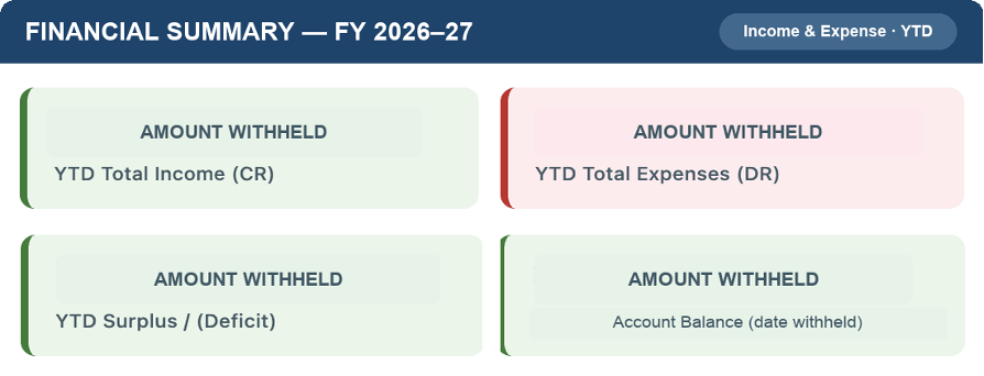
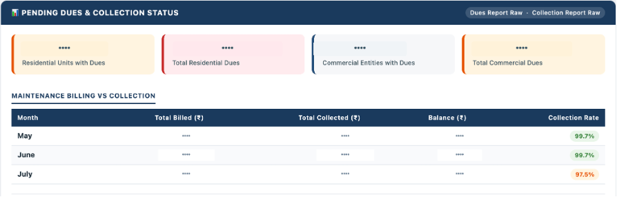
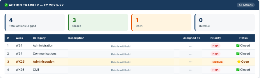
I mapped every section before writing a single prompt: a header strip with the week number, a financial snapshot with one number per card, maintenance collection percentage, helpdesk status by category, a pending dues table by unit, an action tracker with owners and due dates, and approved vendor commitments. Seven sections, each mapped to specific columns in specific sheets.
The brief to Claude looked roughly like this:
“I want to build a weekly management dashboard as a single HTML file. The data comes from an Excel master file with these sheets: [list]. Here are the sections I need and where the data for each lives: [breakdown]. This is for internal use, prioritise clarity and information density over visual polish. Flag things needing attention in amber or red, healthy metrics in green.”
What actually broke on the first version
Claude generates a script. You run it. The first output is structurally right and calibration-wrong. That’s normal, not a failure.
My first version needed three corrections: the helpdesk count pulled all-time tickets instead of the current month; the bank opening balance was calculated incorrectly and had to be back-derived from the first transaction; and the action tracker mixed closed items with open ones.
Each fix was one sentence back to Claude: “The helpdesk section is showing 847 tickets, it should only show this month’s, filter by the date column.” Fixed in one exchange. Budget minutes for this loop, not days.
Designing for scanning, not reading
A dashboard fails the moment someone has to read it to understand it. It should communicate status through color and position, not prose.
Green for healthy. Amber for watch this. Red for needs action now. Stat cards for the handful of numbers that matter most; everything else below in tables. I deliberately used no charts. For these weekly decisions, a number in context was faster than a graph to decode.
You don’t need to specify every visual detail. Tell Claude the principle: “Design for scanning, not reading. Use color to communicate status.” It makes reasonable defaults. You correct what doesn’t feel right.
Making it a one-command habit
The dashboard that gets used is the one that takes one command. For me, the weekly run is python3 generate.py, no arguments, under ten seconds. It reads the Excel file, detects the current week, and writes the HTML.
This is what actually beats Format Drift: not willpower to “keep the format consistent,” but a script that has no way to be inconsistent because it isn’t being rebuilt by hand each time. If you’re working with Claude in a persistent session, you can skip the terminal entirely: say “generate the dashboard” and it runs the script and hands you the file.
Where it lives
Once the script runs, I upload the output to a dedicated GitHub repository with Pages enabled. Hosting is free, and each upload is live within about a minute.
That choice works only for data you are comfortable making public. GitHub Pages is not private hosting by default. For anything sensitive, keep the HTML local or use access-controlled hosting. The file needs no server and can be shared directly.
That’s a call worth making based on what’s actually in your dashboard, not a rule either way.
What this actually cost
- Data source: Excel master file (Built It-One Time)
- Script generation: Claude (Existing subscription)
- Script runtime: Python 3 (Free)
- Hosting: GitHub Pages (Free)
- Setup time: One session with Claude (~3 hours)
- Weekly run time: Data update + one command (~10-15 minutes)
The compounding value
The real payoff isn’t the dashboard. It’s what it does to the conversation.
Before: “what’s the helpdesk status?” and someone opens an app, filters manually, reports verbally.
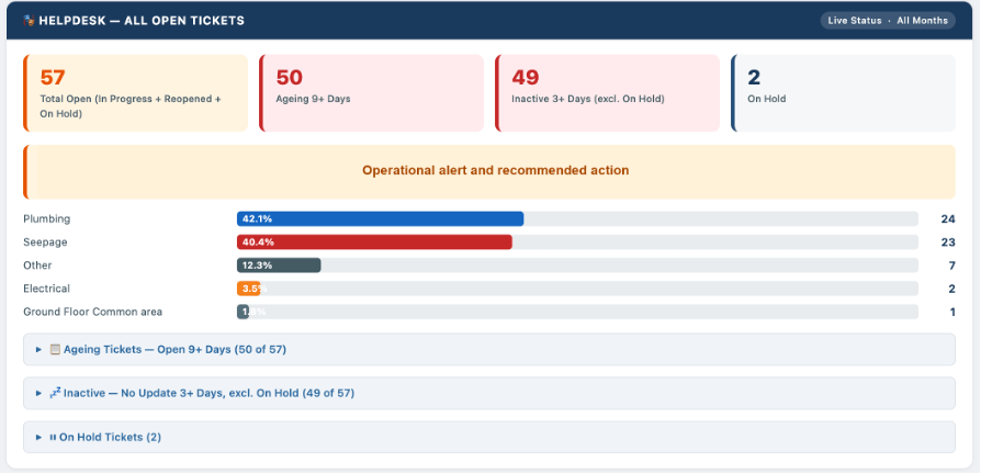
After: “the dashboard shows 14 open tickets, 6 in plumbing, 3 older than 10 days, can facilities update us on those three?”
The meeting moves faster because the argument about what the data says is already over.
What’s next
This solves the internal version: fast, raw, built for decisions. It does not solve the other half of the problem, communicating the same underlying data to people who don’t want a raw table, who want a story. Different audience, different rules, different build. That’s next.
Found this useful? I will continue sharing practical strategies for operationalising AI in future editions of The Abhay Perspective. Subscribe below and to my LinkedIn newsletter for future updates.
If you want to explore how any of this applies to your context, let’s talk. https://theabhayperspective.com/work-with-me/


Leave a Reply